Taiga / Taiga Preset
Built by Shopify Experts for Growing Brands
A complete, high-performance Shopify theme with bold visuals and flexible merchandising — curated for bag, backpack, and outdoor gear brands through the Taiga preset.
Built by Woolman
Woolman is a Shopify Platinium Partner with years of experience building and growing ecommerce brands across industries. That hands-on work shapes how we design our themes — with a deep understanding of what actually drives conversions, usability, and long-term growth.
Blazing Fast
Taiga is optimized for great performance right out of the box. JavaScript is deferred and loaded conditionally — only what the page needs. Images are lazy-loaded with sizes and srcset attributes. The result: fast initial paint and smooth interactions on every device.
SEO Ready
JSON-LD structured data for products, articles, breadcrumbs, and FAQs — all generated automatically. Open Graph and Twitter meta tags, canonical URLs, and meta descriptions are built in. You can even toggle product structured data off if an app handles it.
Accessible by Default
Skip-to-content links, focus trapping in modals and drawers, keyboard-navigable menus, and screen reader labels throughout. Animations respect the prefers-reduced-motion setting automatically.
Development Friendly
Taiga's inspiration lies in simplifying developers' work while providing an exceptional experience and design. In addition, Taiga's modular codebase makes it easy for developers to add custom functionality or remove unused code without affecting the overall stability of the theme.
Superb Support
Get fast, friendly help from our highly praised support team — we’ve got your back whenever you need it. Our team is made up of experienced Shopify Experts with years of hands-on knowledge of the Shopify platform and theme development.
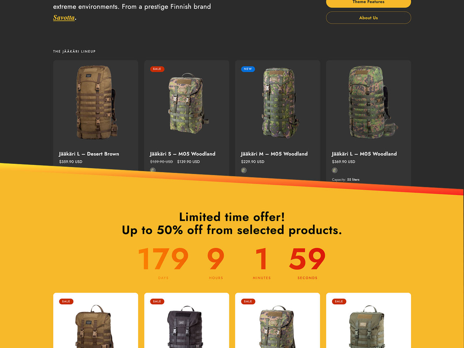
Built for Adventure, Designed to Sell
Every feature in Taiga is designed with one goal in mind: helping merchants sell more. From product storytelling and flexible merchandising to performance and accessibility, the theme gives outdoor brands the tools to build stores that customers enjoy shopping.

Complete Customization
A Design System, Not Just Settings
Five color schemes ship out of the box — and you can create as many as you need. Full typography control covers fonts, scaling, line height, letter spacing, and casing for headings, body text, navigation, buttons, and badges. Separate mobile and desktop controls run throughout. Border radius, CSS animations, and icon stroke weight are all globally configurable.
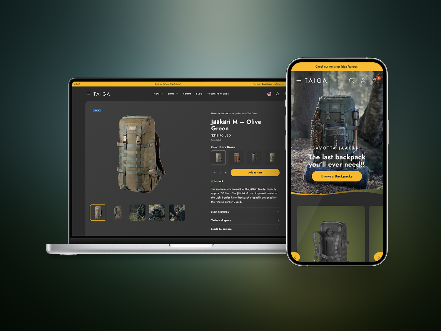
Built for every screen
Designed for Mobile and Desktop
Taiga treats mobile as a first-class surface, not a fallback. Where other themes offer a handful of mobile overrides, Taiga provides a complete parallel control layer — separate settings for nearly every visual decision, on every section, across the entire theme. You're never forced to compromise one viewport to serve the other.
Video anywhere
Video Is a First-Class Citizen
Most themes treat video as an afterthought — a single section tucked somewhere on the page. Taiga takes a different approach. Across more than 15 sections, every media block offers the same flexible choice: upload an image, use a Shopify-hosted video, or paste a YouTube or Vimeo URL.
This means you can build an autoplaying campaign film as your hero, embed a product demo next to your description, run field-test footage in your banner grid, and show a capacity guide walkthrough in your FAQ — all without apps, custom code, or layout hacks.

Cart That Converts
Three Cart Modes. One Goal.
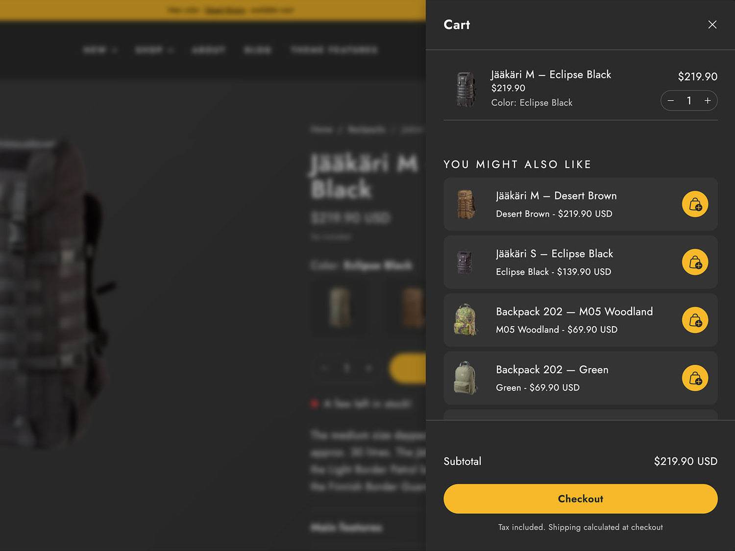
Choose between a drawer cart, a dedicated cart page, or a slide-in notification — whichever fits your brand. Every mode includes a free shipping threshold bar, cart notes, product recommendations, and accelerated checkout buttons. Recommend side pouches, harnesses, and accessories at checkout without slowing shoppers down.
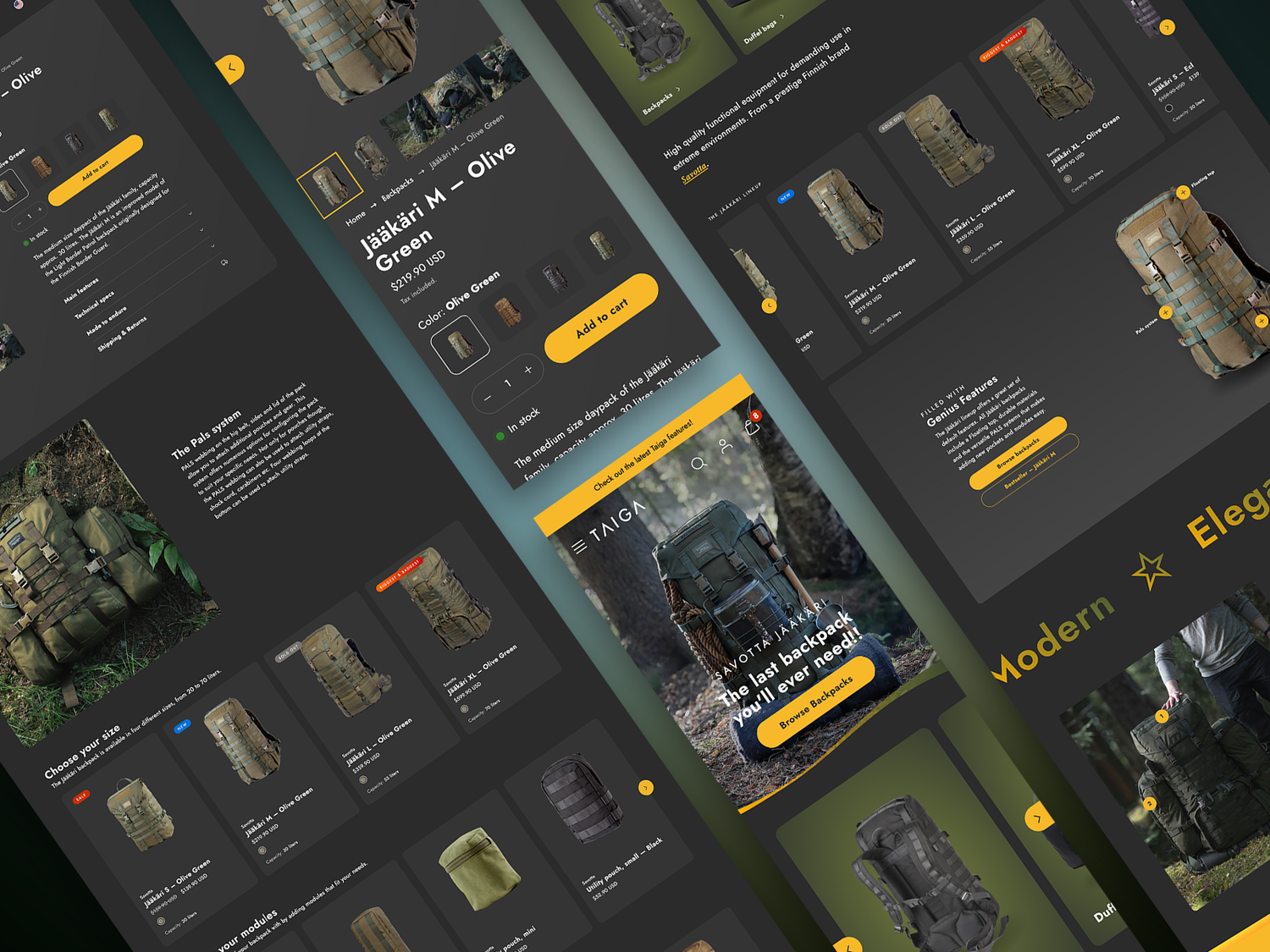
Visual Storytelling
Tell Your Story Visually
Create immersive brand experiences with a complete editorial toolkit. Build seasonal campaigns with hero banners and slideshows, create curated layouts using banner grids and image duos, showcase authentic photography with galleries, and bring products to life through video sections. Finish campaigns with sliding text and customize every section directly in the theme editor.
Product Experience
Designed to Turn Browsers into Buyers
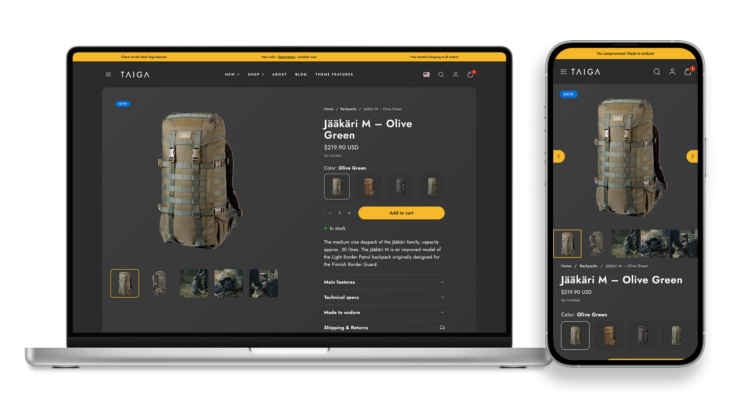
Give your customers everything they need to feel confident right on the product page. Showcase products with immersive visuals, keep purchase options visible as they scroll, and make key details like capacity, materials, availability, and technical features, easy to find.
Sections & Features
Make Shopping Effortless, and Selling Even Easier
Give your products and brand the attention they deserve with versatile sections. Guide customers from day packs to expedition loads — or from a backpack to pouches and accessories. These features make your store easy to navigate and built to convert, surfacing the right products at the right time.
Sections highlights
Price transparency
Shoppers don't just want to know what something costs — they want to know why. The Price Transparency section breaks down product pricing into visual, percentage-based rows covering materials, labor, margin, and more, giving conscious consumers the context that turns hesitation into confidence.
Pricing pulls automatically from the product or a shop metafield, so there's no manual upkeep as prices change.
Countdown timer
Build anticipation before a drop and keep the momentum going after. A full-hero countdown timer with background imagery, customizable messaging, and a built-in post-timer state — so when the clock hits zero, the section automatically transitions to a new message with an optional call-to-action. No manual intervention needed.
Perfect for product drops, flash sales, limited editions, or any campaign where timing is part of the story.
Before and After
A draggable image comparison slider that lets shoppers see differences side by side — ideal for product demos, material quality showcases, or before-and-after transformations. Customizable labels and aspect ratios.
That tactile, back-and-forth interaction keeps people on the page longer and builds confidence in exactly the kind of claims that are hardest to convey with words alone: texture improvements, color accuracy, finish quality, visible results.
Image with Hotspots
Highlight product features with the Image With Hotspots section. Each hotspot opens a dedicated popup with the possibility to use text with images or video — giving shoppers the detail they need, right where they need it.
And it works. In our heatmap and session recording studies, hotspots consistently rank among the most interacted-with elements on the page. Shoppers actively seek them out, click them, and engage with the content inside — making this section one of the most effective tools for communicating product value without cluttering the layout.
Great video support
Video content is widely available in sections. You can opt to us a video instead of a image or have mixed sources from metafields. Depending on the used sections you get additional video settings like autoplay and controls.
Unique Divider
The Divider sections gives you the ability to use built in graphics to divide and separate different parts of your pages. This gives nice visual appeal and helps the users group different parts of the pages easier making the overall UX of your online store better than the competition.
Feature highlights
Versatile Megamenu
Versatile and easy to use megamenu blocks give you the ability to add in-menu content with ease and confidence. Choose between banners, products or columns structure. Megamenus work hand in hand with the normal menus or if you like just use the megamenu content to device your menu sturcture.
Predictive Search
Real-time results for products, collections, pages, and articles appear as shoppers type. Add curated search recommendations for popular terms. Full ARIA support for screen readers and keyboard navigation.
Announcements Bar
Multiple announcement blocks with their own color schemes, font choices, and sizing. Always visible at the top of the store. Promote sales, shipping thresholds, or store updates without touching the homepage.
You can also replace the default announcements bar with the Sliding text and image section, just like here in Hehku.
4 Presets
Taiga, Bubbly, Meadow, and Hehku — each with distinct typography, color palettes, and layout defaults tailored to different brand aesthetics. Pick one as a starting point and customize from there.
Newsletter Capture
Capture emails with a dedicated section, a footer block, or a timed popup modal with frequency controls. All three use Shopify's native customer form — no app required for basic email collection.
Localization
Built-in language and country selectors in the footer and mobile menu. Currency code display toggle for international shoppers. Theme strings translated into 8+ languages including English, German, French, Finnish, and Swedish.
Product page features
Showcase-Ready Media Galleries
Give every product the presentation it deserves with flexible grid, slider, and thumbnail layouts, plus one-tap zoom for close-up detail. Merchants selling visually driven products — apparel, home goods, art, food — can match the gallery style to their brand instead of settling for a generic image stack, helping shoppers linger longer and trust what they're buying.
Sticky Add-to-Cart Bar
Keep a slim bar with product image, price, and an Add to Cart button pinned to the screen as customers scroll through descriptions, reviews, and recommendations. It turns every scroll into a buying opportunity instead of a distraction, capturing purchase intent the moment it peaks — even deep down the page.
Bulk & Multi-Buy Shortcuts
Add quick-select quantity buttons like ×6, ×12, or ×24 right next to the buy button, so stocking up takes one click instead of manual typing. It's a simple nudge that lifts average order value automatically, especially valuable for consumables, subscriptions boxes, or case-pack products.
Real-Time Stock & Urgency Messaging
Automatically display "only 3 left," "low stock," or "more inventory arriving" messages based on live inventory data. This creates authentic urgency that pushes hesitant shoppers to buy now, without merchants having to manually watch stock levels or write copy for every product.
Complementary Product Upsells
Curate "goes well with" or "you'll also need" products directly on the product page, with quick-buy options that don't force customers to leave and start over. It's one of the easiest ways to lift average order value, since the suggestion appears at the exact moment a customer is already committed to buying.
Trust Badges & Star Ratings
Display review scores and small credibility badges — organic, handmade, warranty, cruelty-free, and more — right alongside the product. These visual trust signals answer unspoken objections before a shopper has to ask, closing the confidence gap that often stalls a first-time buyer.
Variant Image Grouping
Automatically cluster gallery images so each color or style shows only its own set of photos in the right order — no accidental mixing of product shots across variants, even for catalogs with hundreds of options. Merchants get a clean, professional gallery experience without manually tagging or reordering images every time a new variant is added.
Sibling Products
Surface closely related products — different scents, colors, or sizes sold as separate listings — as a browsable swatch strip right on the page, automatically scrolling to highlight the one currently being viewed. This helps merchants who split products into individual listings (rather than variants) keep shoppers discovering the full range instead of hitting a dead end on just one option.
Collection page features
Smart Product Filtering
Let shoppers narrow down large catalogs instantly with filters for price (a drag-to-set range slider), color swatches, size, and any other product attribute — all without leaving the page. Merchants get this for free from their existing product data, meaning zero manual setup, faster product discovery, and fewer shoppers giving up on a category with too many options.
Flexible Pagination & Infinite Scroll
Choose the browsing experience that fits the catalog: classic numbered pages, a "Load more" button, or fully automatic infinite scroll that loads new products as customers scroll. Merchants running large catalogs or mobile-heavy traffic can pick the option that keeps shoppers engaged longest, without needing separate apps or custom development.
In-Grid Promotional Banners
Drop image, video, or YouTube/Vimeo banners directly into the product grid at any position, spanning multiple columns for a magazine-style layout. This turns a plain product list into a merchandising opportunity — perfect for spotlighting a sale, a lookbook, or a seasonal story right where shoppers are already browsing.
Instant Sort & Live Filtering
Sorting and filtering update the grid instantly in the background — no page reloads, no lost scroll position — while still updating the URL so filtered views can be bookmarked or shared. The result feels closer to a native app than a typical online store, which keeps browsing sessions longer and reduces bounce from a slow, clunky experience.
Quick Add From the Grid
Let customers add simple, single-variant products straight to cart from the collection page, skipping the product page entirely. This shortens the path to purchase for impulse buys and best-sellers, which can meaningfully lift conversion on high-traffic collections.
Product cards
Product Cards, Secondary Hover, Quick Buy & Variant Availability
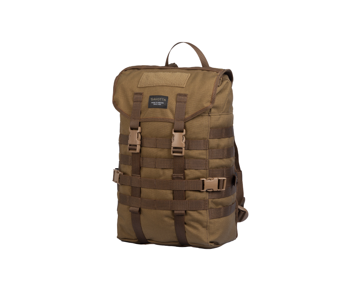
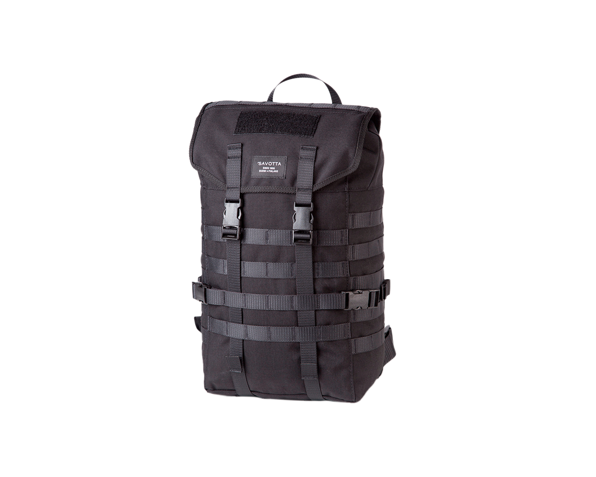
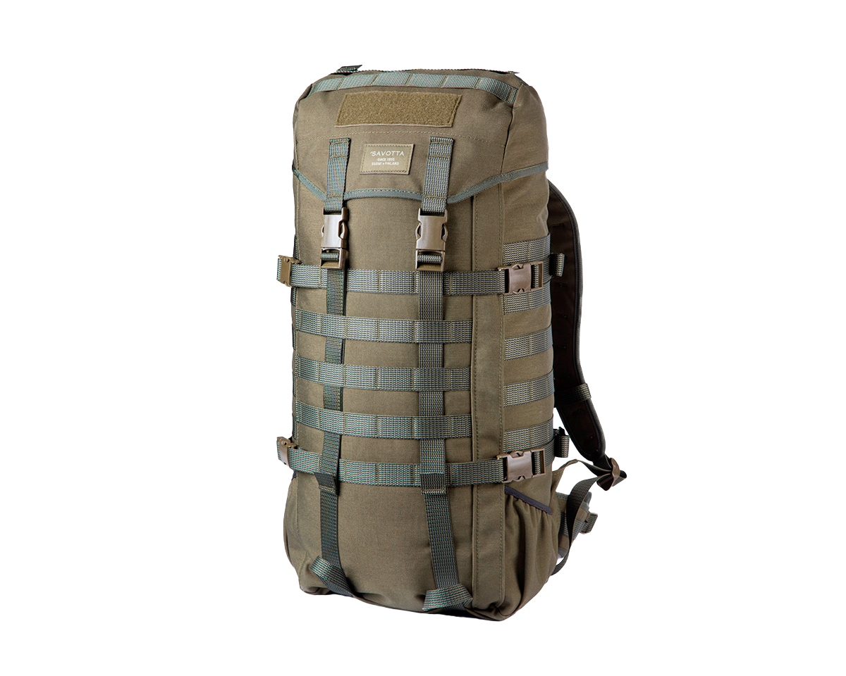
Product cards are more than product previews—they're designed to help shoppers compare, discover, and purchase more easily. Control image behavior with customizable aspect ratios, padding, and hover images, then highlight products using flexible badges for sales, new arrivals, sold-out items, or custom labels.
Help customers make decisions faster with built-in color swatches, variant availability, and product metafields displayed directly alongside the title and price.
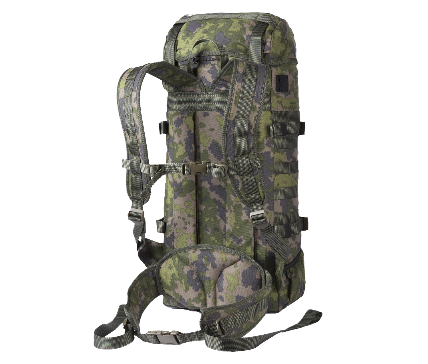
Jääkäri S – Brun désert
Jääkäri S – Noir Éclipse
Jääkäri M – Vert olive
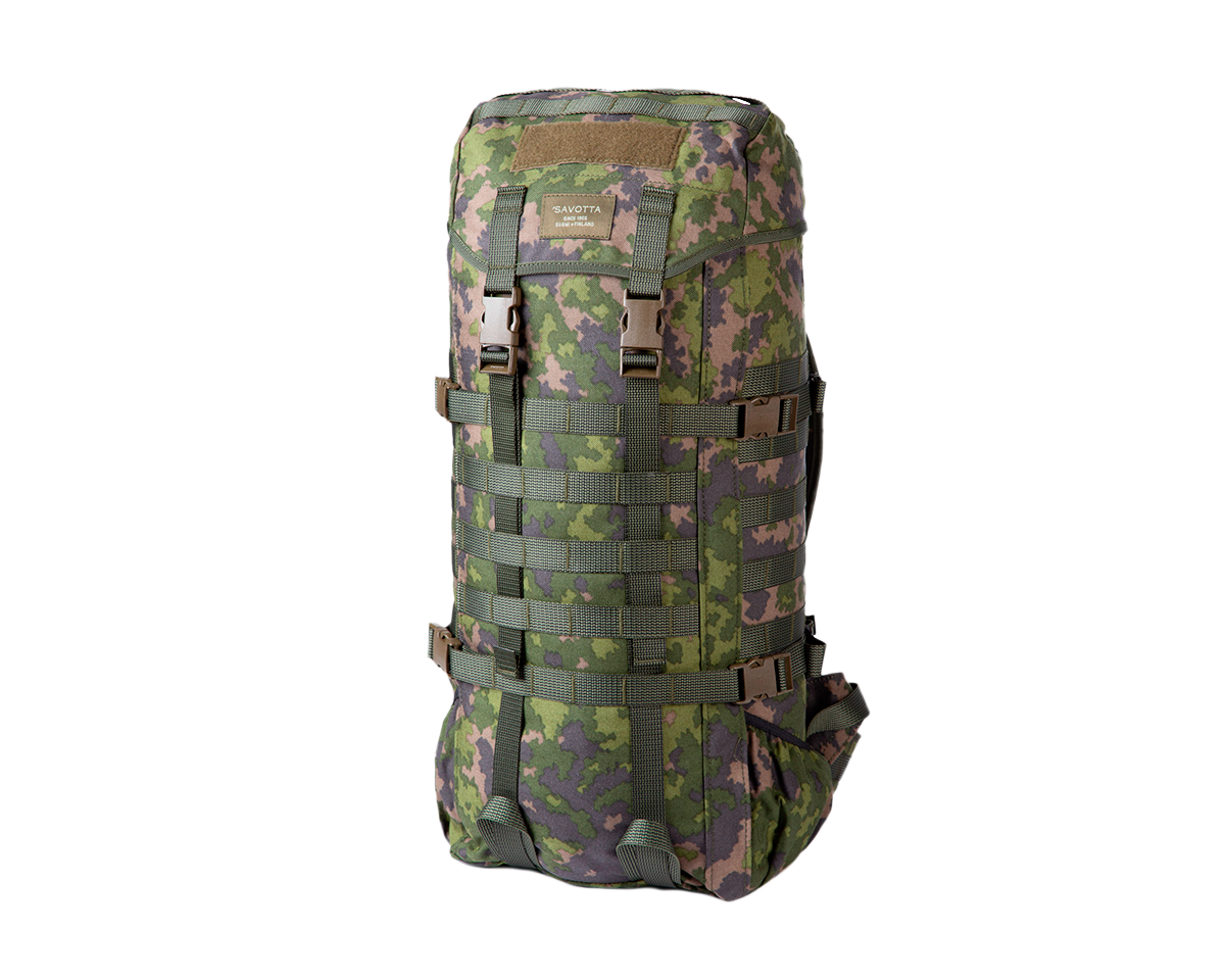
Jääkäri M – M05 Forêt
Top Reviews
Trusted by Merchants Worldwide
Taiga is trusted by merchants around the world, with a 100% positive rating on the Shopify Theme Store. From outdoor retailers to established equipment brands, merchants consistently highlight its performance, flexibility, and ease of use — making it a reliable foundation for building and scaling modern ecommerce experiences.
“— Taiga MerchantThe Taiga theme works well for our store. It's fast, feature rich, and easy to configure. The bold layouts and product detail tools are a great fit for technical gear. Support is responsive and helpful — would definitely recommend.
“— RiverCross DioramaI chose the Taiga theme and I am very pleased with it. Talk to Akseli, and the responsesare always fast and precise. For broader requests, I am sometimes referred to external apps or Shopify support, but for anything directly related to the theme, the support has been excellent.
“— Official SALTSTONE StoreThe Taiga theme works well! It's fast, feature rich, and easy to configure. Support is responsive and helpful! Would definitely recommend to anyone looking for a modern and well working template!
Ready to build your store?
Taiga gives bag and outdoor brands everything needed to create a fast, beautiful, and accessible online store. Start with the Taiga preset, customize it to match your brand, and start selling.